

Honor the fallen, empower communities, and preserve the legacy of service.
CLIENT
The Lucky Foundation
Based out of Texas, the Lucky Foundation is a 501(c)3 nonprofit that provides community and funding for the families of fallen or disabled Military Members and First Responders. They also offer scholarships for the children of those heroes.
SERVICES
Visual Identity, Logo Design, Art Direction
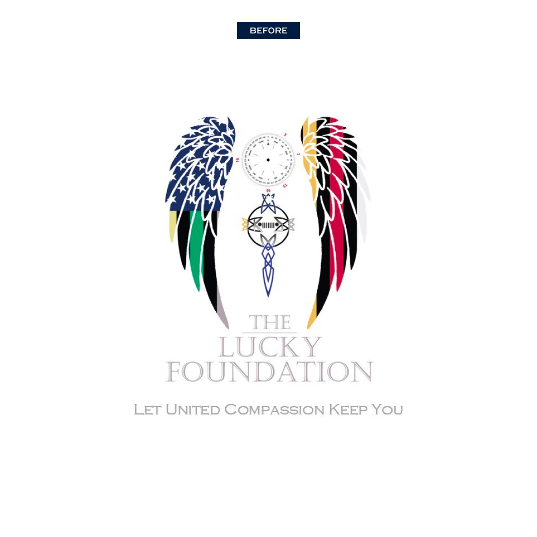
The founder, Kristina Manuel, originally launched the nonprofit with a logo based on an in memoriam tattoo for the foundation’s namesake. As the organization began to grow, they needed a visual identity system that represented the many legacies being honored. The primary challenge was to design a new logo that combined visuals for military and first responders as well as the messaging of the foundation’s goals and values.
A Mark of Legacy
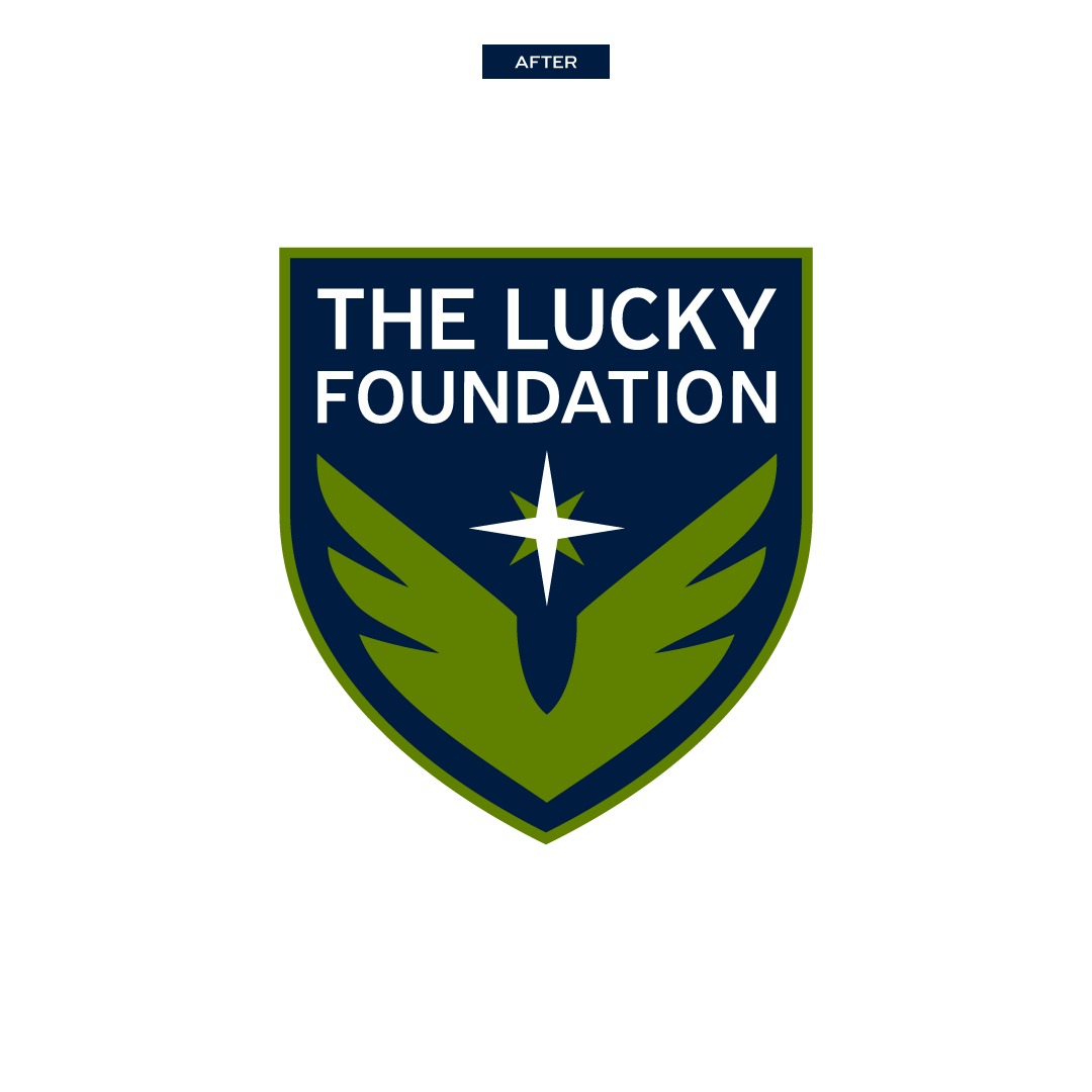
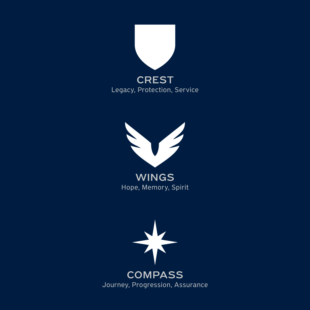
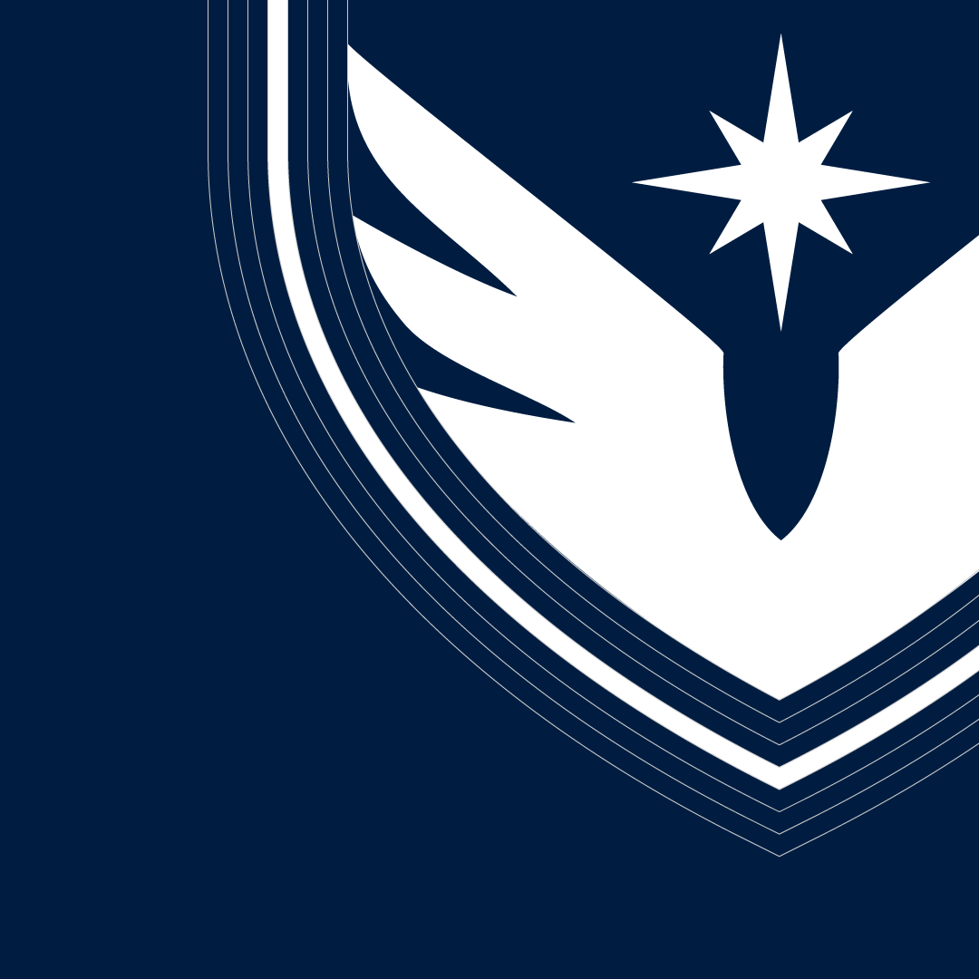
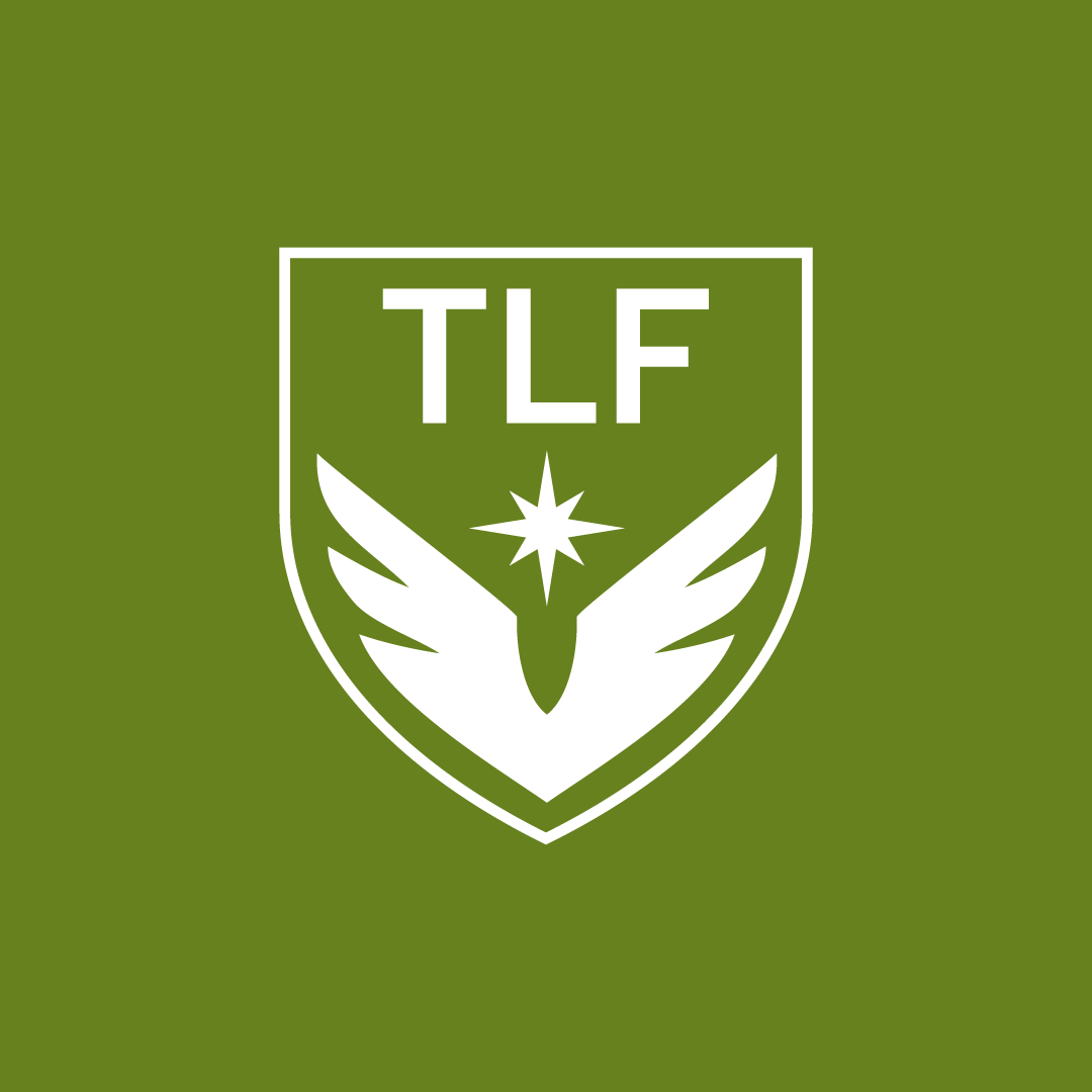
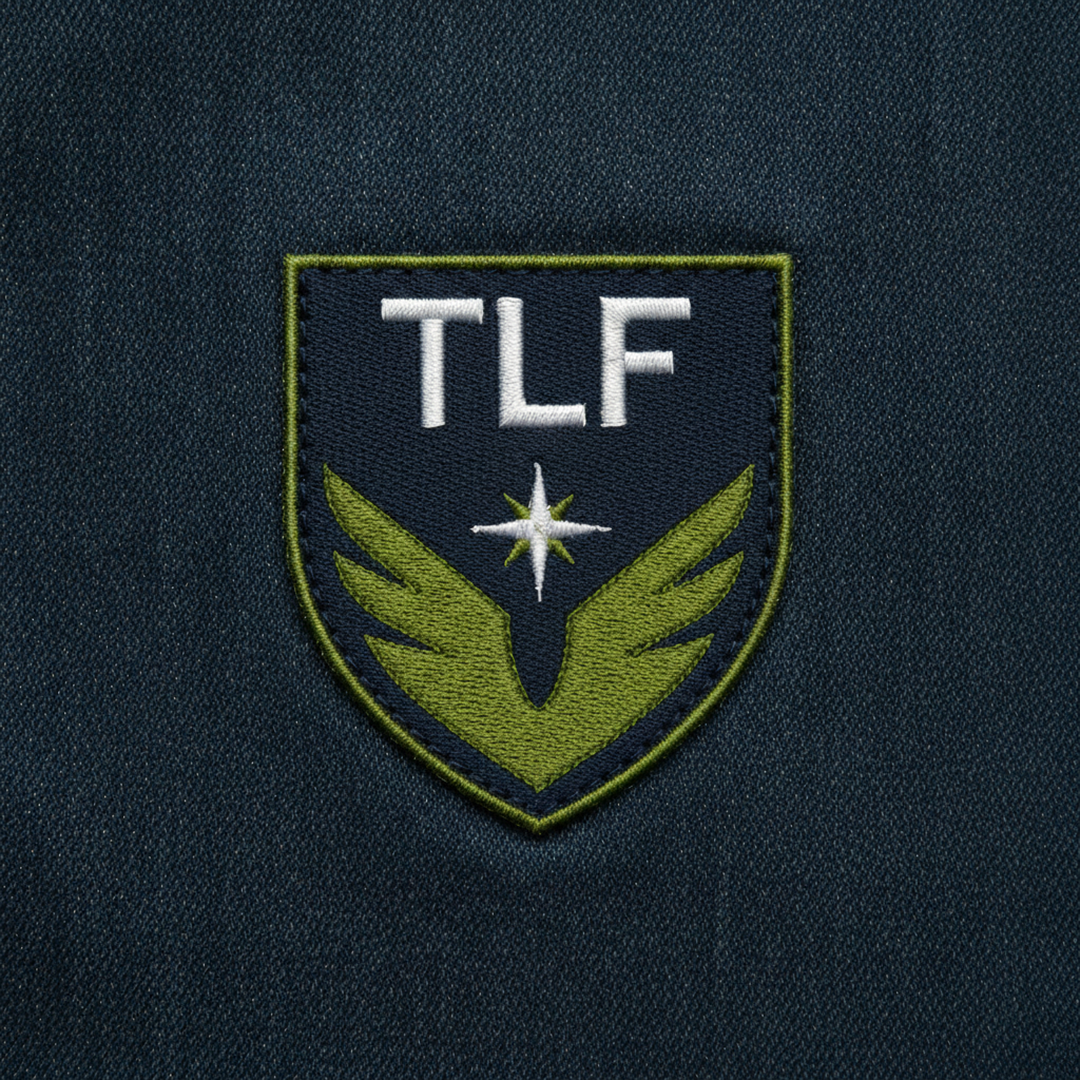
Our approach was to maintain the legacy of the original, sentimental logo. During the discovery phase, elements and concepts most relevant to the foundation were identified and refined before moving into the creative exploration. The new logo needed a more scalable design without compromising the rich history and mission. In the end, the final design continues to maintain the wings and compass elements and introduces a crest element.
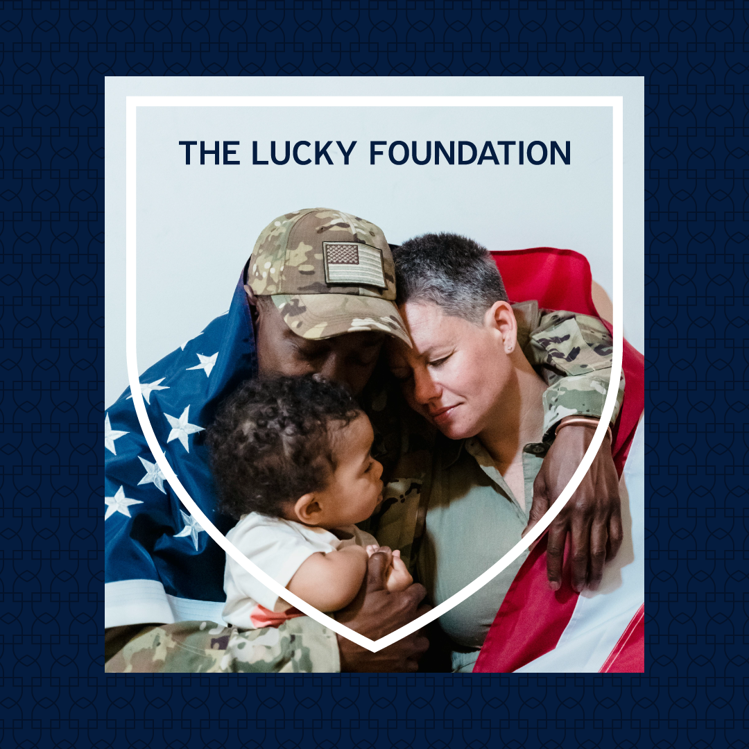
The newly added crest shape encloses the full logo, resembling a badge or patch worn by the military and first responders. It serves to pay homage to the core community served by the foundation.
The wings change from the traditionally angelic style to an uplifting, proud design. While they still represent the memory of those passed, the raised movement also inspires hope and unbroken spirit.
Lastly, the compass becomes simplified in order to have a stronger presence in the overall design. A clear symbol of the journey taken as well as the journey ahead. The Lucky Foundation exists so that no one journeys alone.
Leading With Intentionality
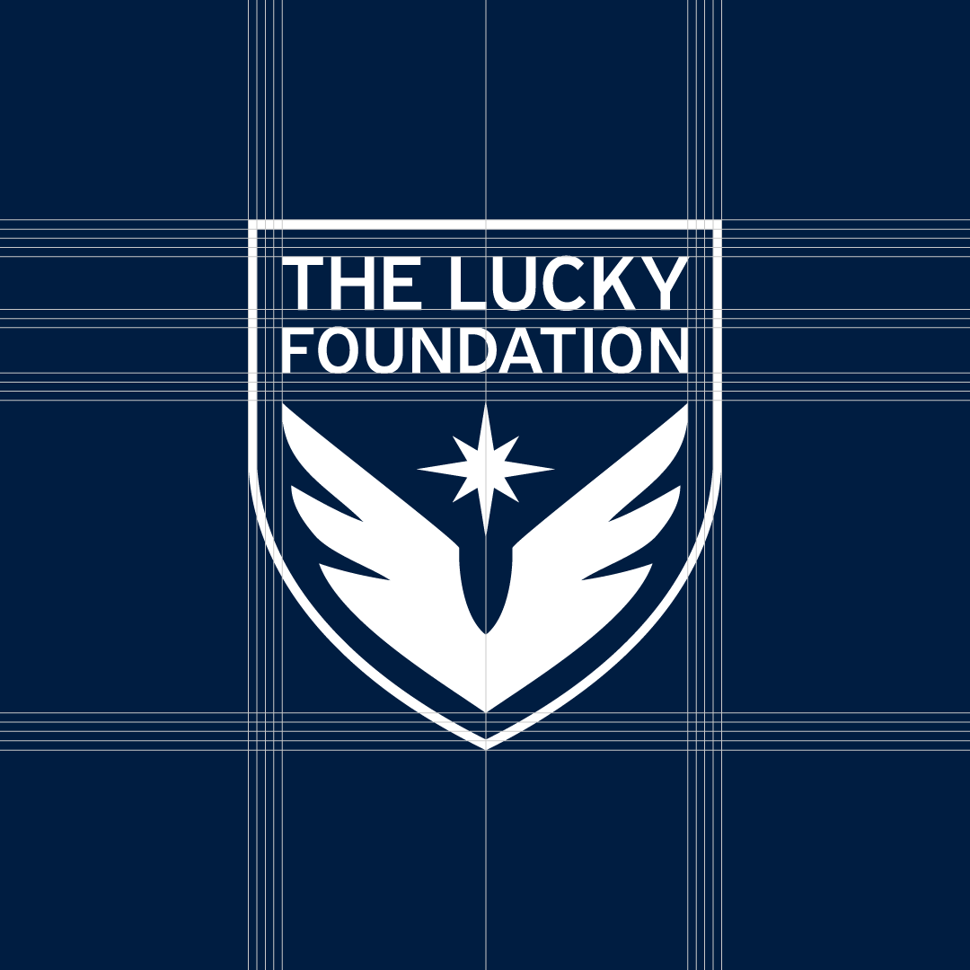
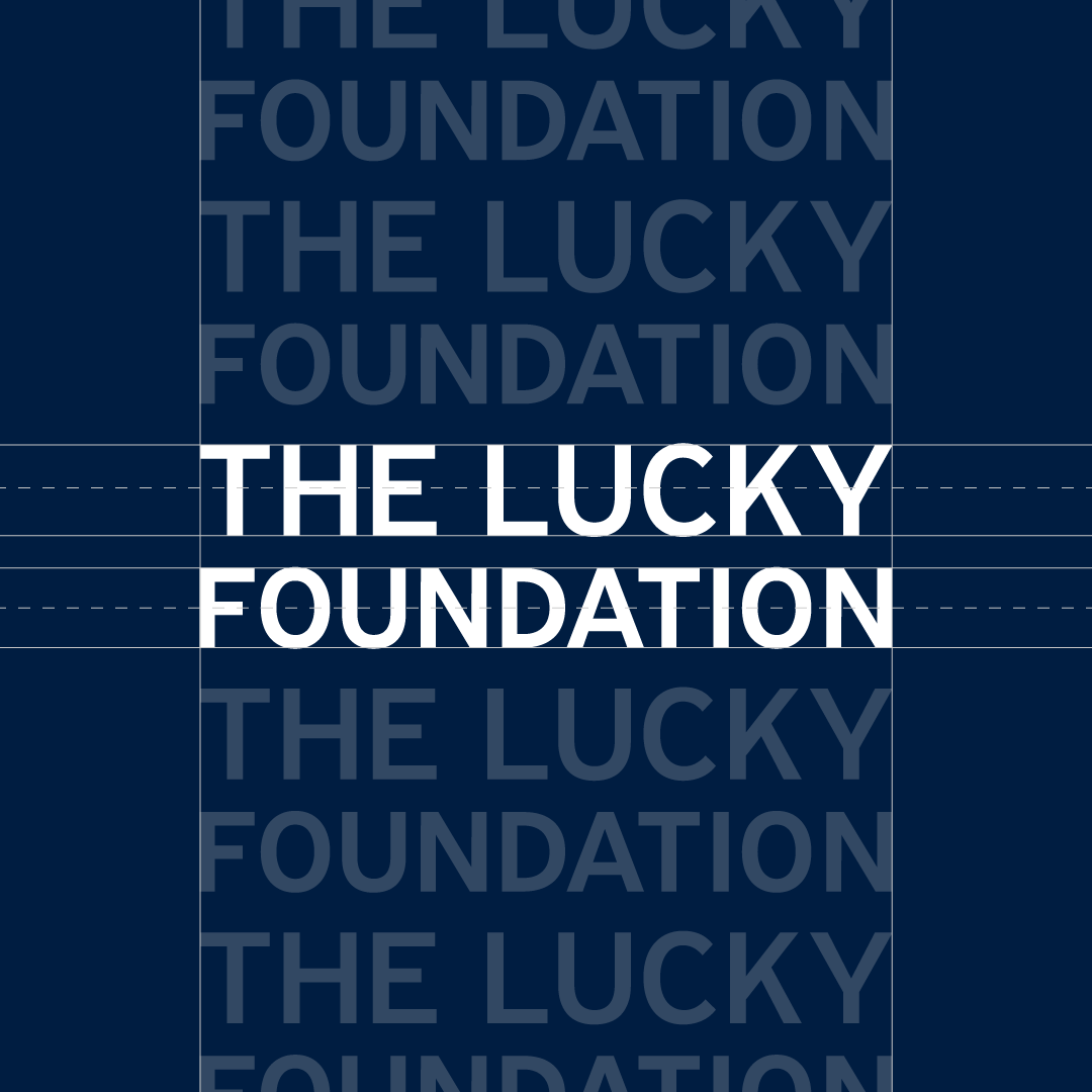
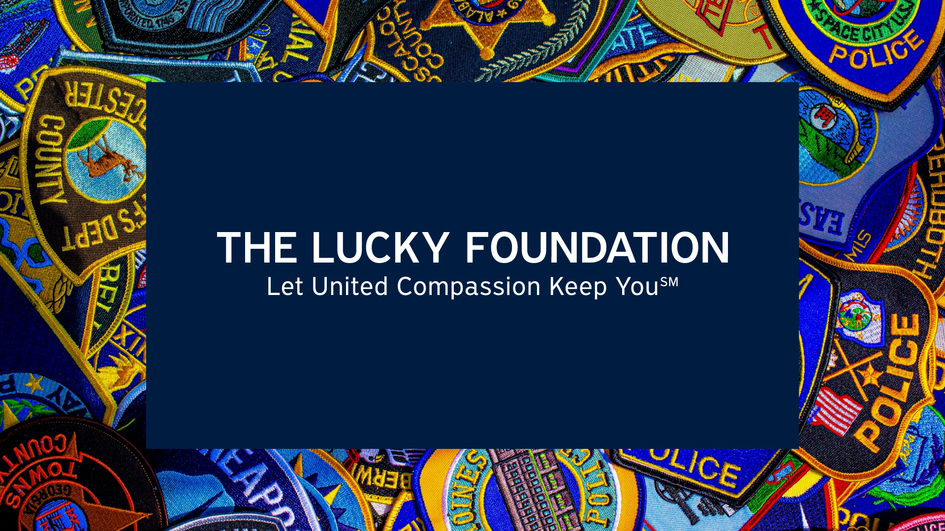
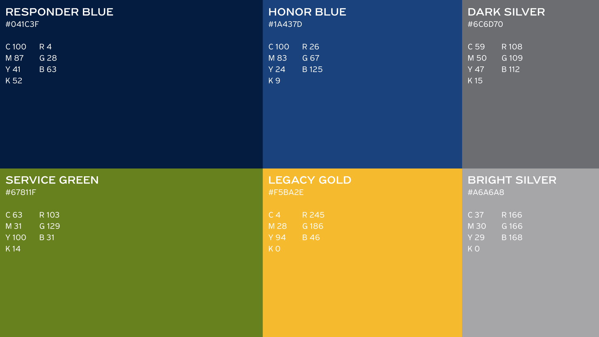
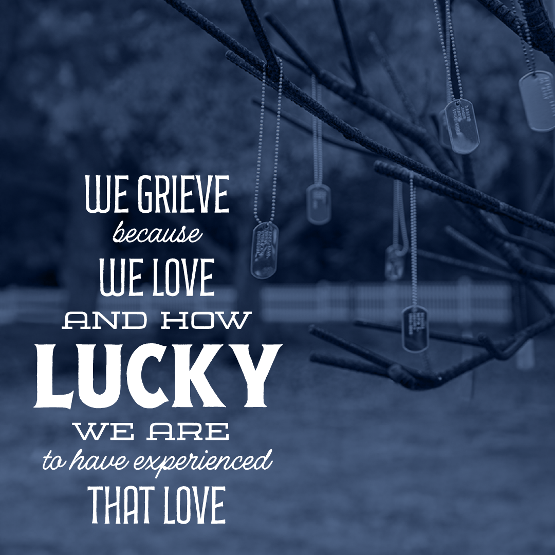
Accessibility is an important brand value, so contrast and balance strongly led the design decisions. The original color palette was challenging to use because it was derived from the First Responders flag, which has eight differently colored stripes. While still inspired by first responders and military, the new palette is more unique and cohesive. This enables it to be extended into the brand pattern and image treatments. A new font was also selected for its specific geometry, weight, and clarity. Slight customizations were made to the typographic mark in order to improve cohesion with the iconography.
Solidified Support
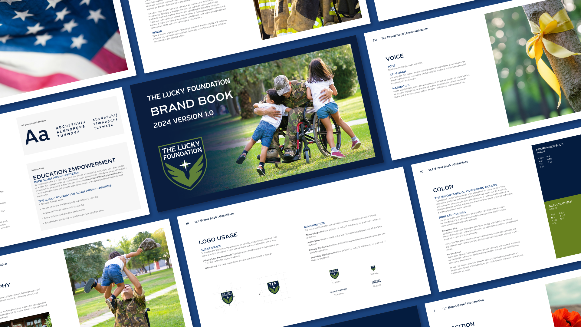
With the logo completed, it was time to organize all of the refined information, guidelines, and ideas that come out of the holistic design process. A brand guide and extensive library of visual assets, copywriting, and direction were all created to support The Lucky Foundation’s newly established visual identity system.
The branding is continuously maintained and updated through a longstanding partnership as Sunward remains the primary design studio to support the organization since 2023. We’re honored to be a part of their living legacy.
“Sunward’s collaborative approach and ability to inspire creativity in others have been key to the successful rollout of our high-profile campaigns. [And they’re] adept at navigating the challenges of the ever-evolving marketing landscape, always staying ahead of trends and incorporating innovative solutions.”
— Founder, The Lucky Foundation