

Powerful software for kind people making the greatest difference.
CLIENT
Provient
Originally established in 1991 as a computer repair business in a small town of Montana, Provient evolved over 35+ years into a customizable SaaS for resource-centered nonprofits. From local food pantries to national food banks, university needs programs to maternity resource providers, Provient is dedicated to developing custom branded and configured management software to those who are making the greatest difference.
SERVICES
Business Naming, Logo Redesign, Visual Identity, Strategy
The company operated under a few names over the decades, but none truly felt right. It was time for a deeper brand evolution to more intentionally target a wider range of clients and form a fully aligned visual identity. Strategic audits and research led to the crafting of a new name, followed by extensive production of freshly aligned branding and marketing plans, digital templates, and custom assets to complete the brand evolution.
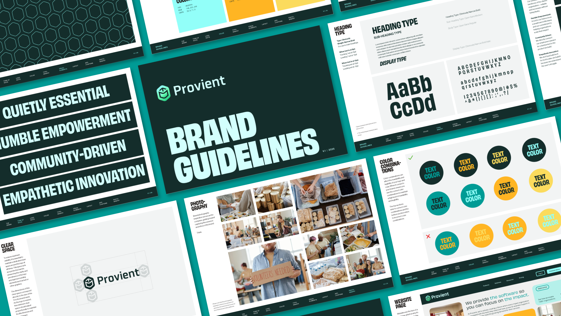
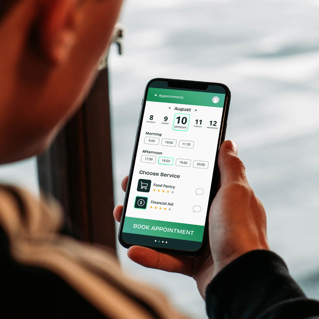
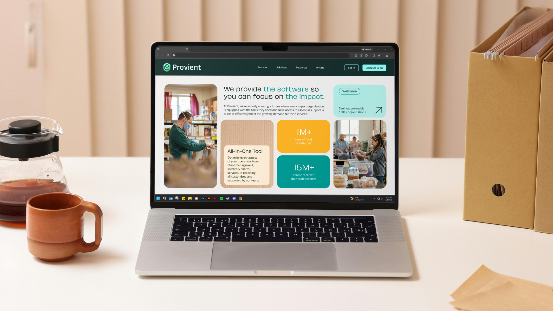
Additional designs were provided for their app and web portal, slide decks for internal and external use, as well as one-pagers for the sales department.
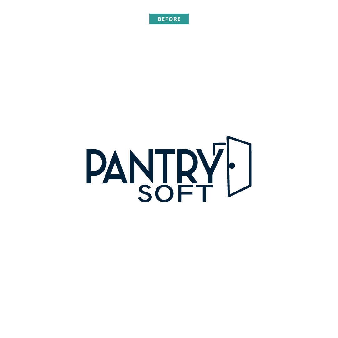
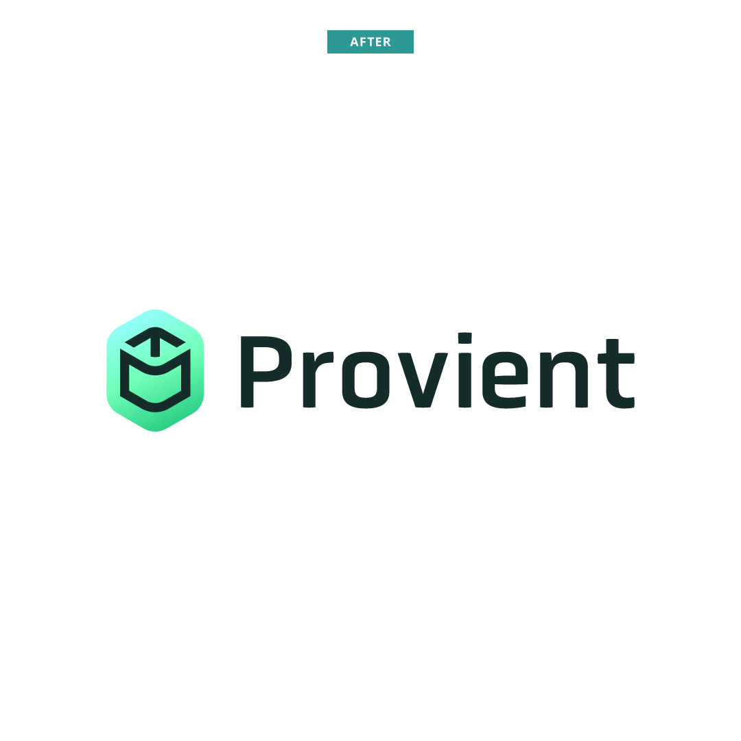
Fully Aligned, Finally
The term “Provient” is an invented word with roots in several key elements of the brand’s history, mission, and products. The rename helped communicate the shift in values and targeting as the company entered their next chapter of operations.
The primary clients are food pantries and food banks, so it was important to connect the concept to that significant base. This was a deciding factor in using a derivative spelling of the Germanic word for provisions (especially food) for a journey: “proviant”. The subtle vowel change served to make the new name more unique and appear more closely related to the word “efficient”, which would be a prevalent term used with the rebrand.
Additionally, the prefix “pro” was very favored for its positive associations. It also was influential that similar words like “professional” and “proven” improved connotations for the new name. It became popular to humorously say “Provient helps provide proficient provisions” throughout the naming meetings.

One Mark for Many Services
There’s a lot to convey for an all-in-one software solution. Two primary goals for the logomark design were to:
More clearly connect with technological themes
Embrace a sense of softness to resonate with the nonprofit industry
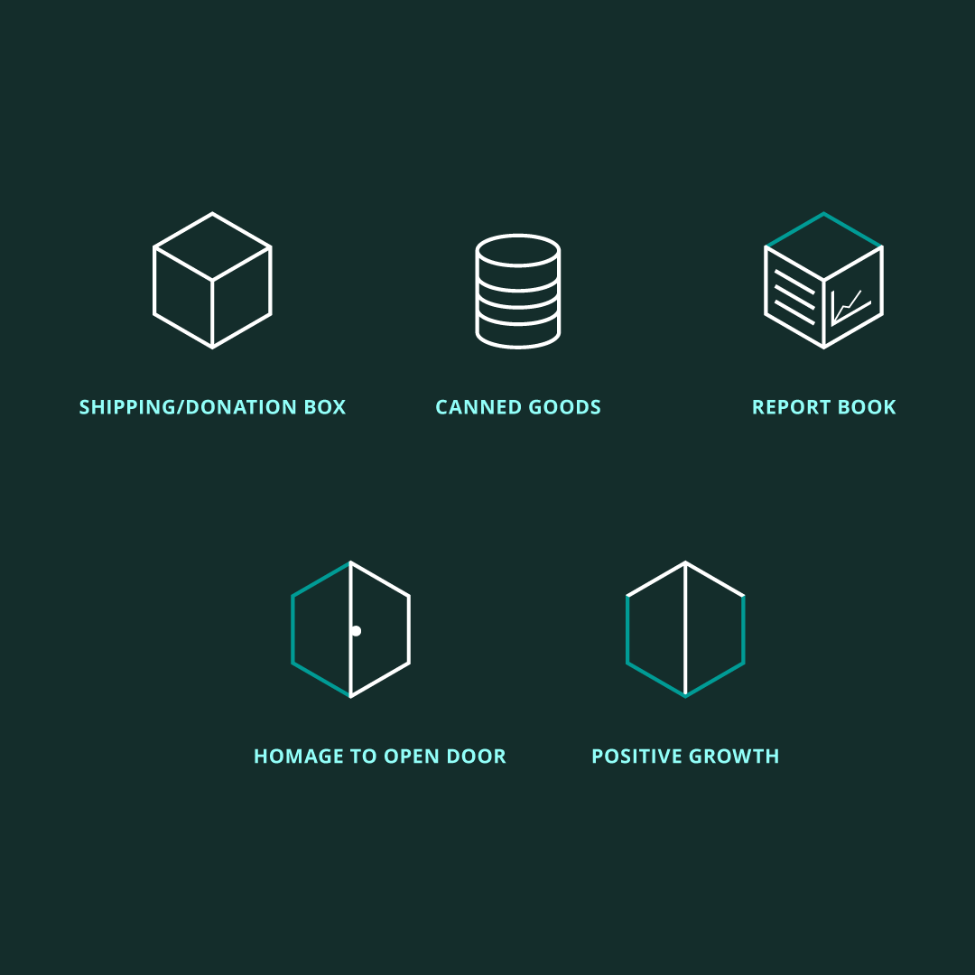
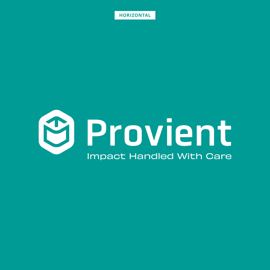
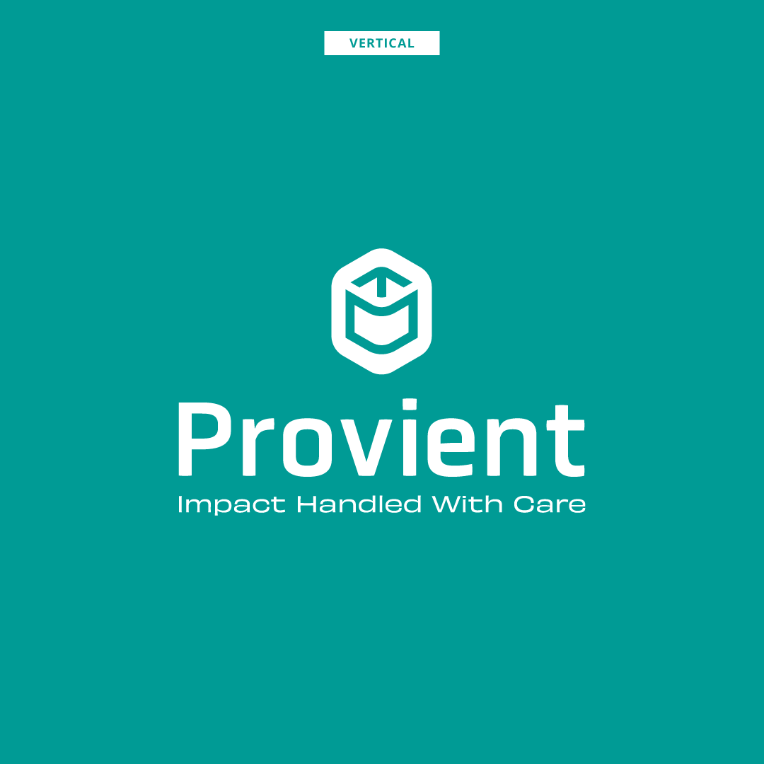
The designed icon references many of the services of the company as well as their clients. It also loosely pays homage to the previous “open door” element. A hexagon anchors the icon and seamlessly brings it closer to recognizable tech stylings. The corners were significantly rounded to create a sense of friendliness and keep the mark from being too starkly modern.
The font Obvia compliments the round, elongated geometry of the icon and perfectly works with the digital-first company. The tagline “Impact Handled With Care” is written in Obviously, a high-personality font that unites the tech branding with the personable team that makes Provient more than just a service.
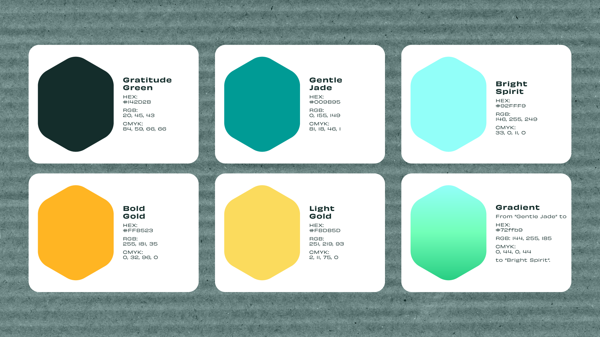
Lastly, the color palette was crafted to be bright and impactful. It needed to stand out from the trend of overly dark and minimalistic palettes of other SaaS competitors.
Initiating Momentum
Brand evolutions come with risk. Done effectively, the resulting traction can boost awareness and increase clients. The rollout of Provient was strategically positioned to be a seamless transition for their current clients, users, and extended community. And it set the company on track to confidently begin the next phase of development and services.
“Sunward is a force to be reckoned with. Such a pleasure working with them.”
— CRO, Provient